Project 1914
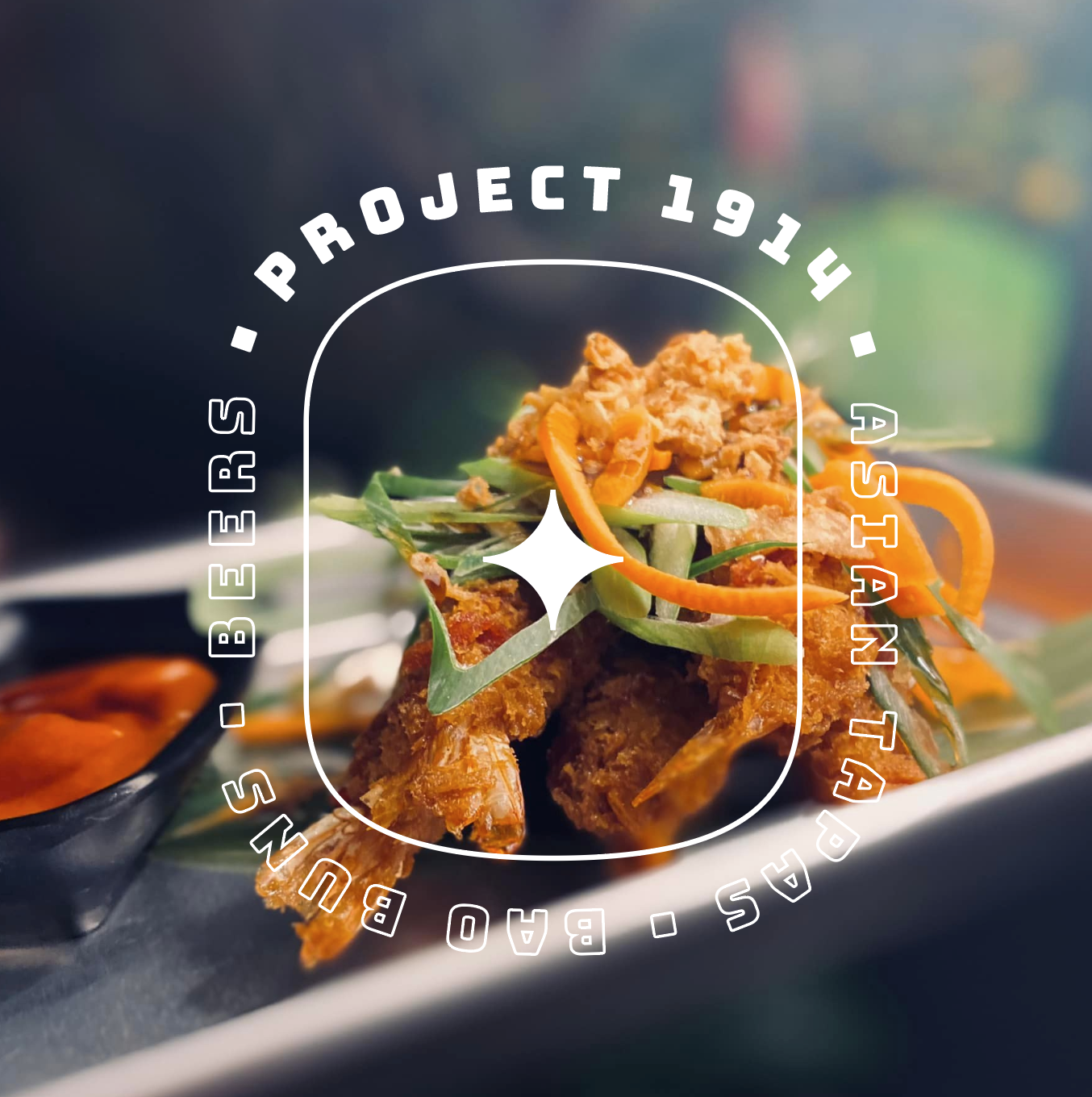
Project 1914 stands as a vibrant Asian tapas restaurant, driven by a singular mission: to deliver delectable and unforgettable flavors. The heart and soul of Project 1914's brand identity emanate from a dynamic, colorful, and whimsical cartoon illustration. This artistic embodiment perfectly encapsulates the restaurant's lively and playful ambiance.
The distinctive appeal of this brand identity lies in its brilliant use of vivid colors and bold lines, ensuring that it not only catches the eye but remains etched in memory. This visual spectacle is further complemented by a typography choice, characterized by a playful and slightly rounded font, which seamlessly harmonizes with the cartoon style.
In sum, the Project 1914 brand identity excels in capturing the very essence of the restaurant, offering a playful and engaging means of recognition. It serves as an invaluable asset across various touchpoints, from social media and outdoor advertising to packaging and merchandise, ensuring a lasting impression and an enhanced customer connection.
[ Identity • Advertising • Packaging • Creative Direction ]


